
How to add interactive Elements to Moodle without coding
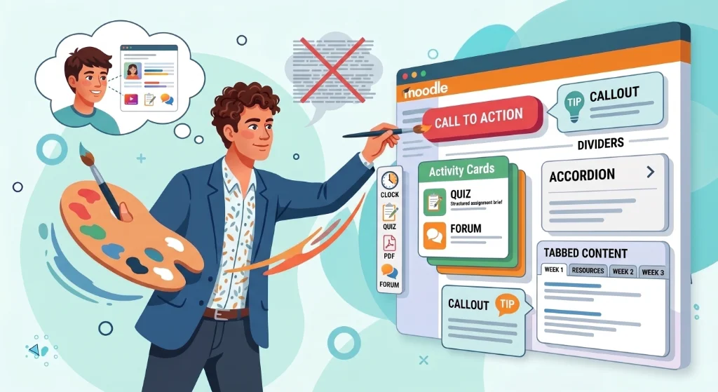
When students open your Moodle course, they do not read every word. They scan for landmarks: Where do I start? What is due this week? Which link do I click next?
Plain text and long lists of files make that scan impossible. Even with high-quality materials, a page without pedagogical structure forces students to hunt for what matters.
Moodle interactive Elements, solve this problem. Buttons, tabs, accordions, tables, and activity cards turn a wall of text into a scannable, actionable learning path. And you do not need HTML, CSS, or admin rights to add them.
Why plain text and links are not enough
The limits of Moodle's native editors
Moodle’s built-in text editors, TinyMCE and Atto, handle everyday writing tasks well: paragraphs, bullet lists, bold or italic text, and embedding images or videos. For straightforward content like assignment descriptions or weekly announcements, they work perfectly.
But these editors reach their limits when you want to build a truly structured page. They cannot create collapsible sections, tabbed interfaces, or responsive content containers without hand-coding HTML.
When you try to force text formatting tools to do structural work, you end up with pages that look organized on your desktop but fall apart on mobile devices or become impossible to maintain over time.
Many teachers try workarounds: copying HTML snippets from forums, using tables for layout, or waiting months for an admin plugin. These shortcuts create fragile pages that break on mobile or become impossible to edit later.
This is where well-intentioned shortcuts start to create real problems, for you, and for your students.
What students actually need from a course page
- Where am I? — What is this course about? What are the key objectives?
- What do I need to do? — Which activities are mandatory? What are the deadlines?
- What comes next? — After I finish this resource, what is the next step?
Interactive Elements answer these questions visually. An accordion for objectives, an activity card for assignments, a callout for critical warnings, and a menu for navigation give students immediate landmarks without requiring them to read every line.
What interactive Elements actually do for learning
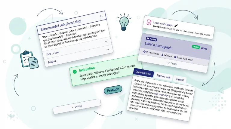
Definition: An Element is a visual container with a pedagogical purpose
A Moodle interactive Element is not decoration. It is a self-contained unit that:
- Groups related information (instructions, criteria, deadlines, resources)
- Signals its purpose through visual design (color, icon, layout)
- Reduces cognitive load by packaging content into scannable chunks
- Guides student action with clear calls to action or navigation cues
Some tools offer types of interactive elements built for real teaching pages. Some blocks are explicitly pedagogical, others are the basic building blocks of a clear page, and they all serve teaching.
How interactive Elements reduce cognitive load and improve engagement
When information is scattered across a long page, students spend mental energy deciphering the layout instead of engaging with the content. Elements solve this by:
- Chunking related content into single units (e.g., all assignment details in one activity card)
- Prioritizing what matters (e.g., callouts for warnings, buttons for next steps)
- Collapsing optional details (e.g., accordions for FAQs, collapse buttons for supplementary readings)
- Structuring data visually (e.g., tables for schedules, icon lists for prerequisites)
By presenting content in bite-sized, logically grouped units, learners stay focused on the immediate task without feeling overwhelmed by the total volume of the curriculum.
The main types of interactive Elements
Some tools offer a library of ready-to-use Elements (also known as content blocks). You pick an element, set the text and options, and it appears ready in your Moodle editor.
| Elements types | Pedagogical role | Example use |
|---|---|---|
| Buttons | Clear calls to action | « Start Quiz », « Submit Your Draft », « Watch Intro Video » |
| Dividers | Visual breaks between sections | Separate weekly topics or major units |
| Accordions | Collapsible sections for optional or supplementary content | Learning objectives, FAQs, glossary terms |
| Tabs | Side-by-side navigation on one screen | Program, Assessment, Resources, FAQ |
| Icon lists | Scannable lists with visual markers | Prerequisites, learning outcomes, step-by-step instructions |
| Callouts | Highlighted notices (tip, warning, info, success) | Critical deadlines, common mistakes, key definitions |
| Activity cards | Structured assignment briefs | Instructions, criteria, deadline, resources, submit button |
| Custom boxes | Colored content frames for emphasis | Welcome messages, module summaries, key takeaways |
| Simple Table | Stylable data tables | Weekly schedule, grading rubric, comparison of concepts |
| Menu | Navigation menu with links and icons | Quick links to Syllabus, Resources, Assignments, FAQ |
| Collapse button | Single button to hide/show a content block | Optional readings, annexes, extended explanations |
| Intro text + Read more | Summary with expandable details | Long assignment descriptions, detailed rubrics |
Each Element is meant to answer a classroom need: guide attention, cut cognitive load, and turn a wall of text into a page students can actually follow.
When to use each type of interactive Element
For course home pages: Accordions, Tabs, Icon lists, Callouts
Use case: Building a clear, scannable entry point for your course.
Recommended blocks:
- Accordions for learning objectives and competencies (visible but collapsible, so they do not flood the page)
- Tabs for program, assessment, and resources (all on one screen, no endless scrolling)
- Icon lists for prerequisites or learning outcomes (scannable at a glance)
- Callouts for welcome messages or key announcements (highlighted, cannot miss)
Pedagogical benefit: Students immediately understand where they are, what is expected, and where to find key information. The page feels structured, not overwhelming.
For assignment briefs: Activity cards, Buttons
Use case: Turning long assignment descriptions into actionable, structured briefs.
Recommended blocks:
- Activity cards to group instructions, criteria, deadline, group size, resources, and submit button in one cohesive unit
- Buttons for clear calls to action (« Submit your draft », « Start quiz », « Watch intro video »)
Pedagogical benefit: Students see expectations at a glance. They know exactly what to do, when it is due, and how to submit. Repeat emails with questions drop significantly.
For dense readings: Callouts, Dividers
Use case: Making theory-heavy or text-dense pages scannable without losing substance.
Recommended blocks:
- Callouts (tip, warning, info, success) at moments students usually get stuck
- Dividers between major conceptual blocks (visual breathing room)
Pedagogical benefit: The material stays the same. The page now paces attention so learners can spot what matters without losing the thread.
For FAQs: Accordions
Use case: Reducing repeat emails by surfacing answers where students already land.
Recommended blocks:
- Accordions for collapsible FAQs on the course home page (six common questions, richest answers first, first item open by default)
Pedagogical benefit: Students find answers immediately, without opening a separate forum activity. Teachers update FAQs in one click when new questions appear.
For schedules and rubrics: Simple Table
Use case: Displaying weekly schedules, grading rubrics, or comparison grids in a stylable, scannable format.
Recommended blocks:
- Simple Table with color-coded rows (lectures, labs, assignments), customizable column widths, borders, shadows, and alignment
Pedagogical benefit: Students see the course rhythm at a glance. They know what to expect each week and can plan ahead. Grading criteria are transparent and easy to reference.
For long courses: Menu
Use case: Adding quick navigation to courses with a lot of sections or important resources.
Recommended blocks:
- Menu with links to Syllabus, Resources, Assignments, FAQ, Contact (icons for visual recognition, optional role-based visibility)
Pedagogical benefit: Students jump directly to what they need. Scroll time decreases, and navigation becomes intuitive.
For optional materials: Collapse button, Intro + Read more
Use case: Hiding supplementary readings, annexes, or detailed rubrics without removing them.
Recommended blocks:
- Collapse button to wrap optional materials (« Optional materials (click to expand) »)
- Intro text + Read more for long assignment rubrics (short summary, expandable details)
Pedagogical benefit: The page looks cleaner at first glance. Students who want depth can expand and others focus on the essentials.
How to add accordions, tabs, and buttons in Moodle (step-by-step)
Adding specific interactive Elements like accordions, tabs, or buttons follows the same simple workflow in My Elements. Here is how to add each of these three block types with concrete examples from real teaching scenarios.
Adding an accordion (for objectives or FAQs)
Use case: A teacher wants to display learning objectives at the top of the course home page without flooding the page with text.
Step-by-step:
-
1
Open your Moodle course page and start editing a Text and media area (or the section summary).
-
2
Click the floating My Elements button, then select Accordion from the side panel.
-
3
Add your objectives as separate items (e.g., « By the end of this week, you will be able to calculate ROI using three methods »).
-
4
Choose which item opens first (usually the first one), adjust colors, width, alignment… if needed, and insert.
Result: Students see the objectives immediately, but can collapse them to access the rest of the page. The page feels structured, not overwhelming.
See also: For FAQs: Accordions | For course home pages: Accordions, Tabs
Adding tabs (for objectives, pedagogical scenario, and prerequisites)
Use case: A teacher wants to organize the course home page so students can quickly access objectives, the pedagogical scenario, and prerequisites without endless scrolling.
Step-by-step:
-
1
Open your course page and start editing a Text and media area.
-
2
Click the My Elements button, select Tabs, and add your tab titles:
- Tab 1: « Learning Objectives »
- Tab 2: « Pedagogical Scenario »
- Tab 3: « Prerequisites »
-
3
Fill in the content for each tab:
- Learning Objectives: List what students will be able to do by the end of the course.
- Pedagogical Scenario: Describe the learning sequence (e.g., « Week 1: Introduction → Week 2-3: Group project → Week 4: Presentation »).
- Prerequisites: List required knowledge or materials (e.g., « Basic Excel skills », « Access to company database »).
-
4
Adjust style (tab or pills position), colors to match your institution's theme, width… and insert.
Result: All key course information sits on one screen. Students can switch between tabs without scrolling, and the page feels organized from the start.
See also: For course home pages: Accordions, Tabs
Adding buttons (for calls to action)
Use case: A teacher wants to make the next step obvious in an assignment brief, so students do not have to hunt for the submit link.
Step-by-step:
-
1
Open any editable area in Moodle (e.g., an Activity description or a Page resource).
-
2
Click the My Elements button, select Button, and set:
- Label: « Submit your draft »
- Link: The URL of the assignment submission page
- Style: Primary (for the main action) or Secondary (for optional actions like « View rubric »)
-
3
Adjust link option (open in new tab), button size, show/hide icon… and insert the button below the assignment instructions.
Result: Students see a clear call to action immediately after reading the instructions. They know exactly what to do next, and repeat emails with « Where do I submit? » drop significantly.
See also: For assignment briefs: Activity cards, Buttons
This no-code approach means you can structure Moodle pages without writing code.
For more details on permissions and data handling, see the My Elements FAQ.
Designing blocks that match your institution's look
Why visual consistency matters
Your Moodle course does not exist in isolation. It sits within your institution’s broader digital ecosystem, and students expect it to feel like part of that ecosystem.
When blocks clash with your campus theme (mismatched colors, foreign fonts, inconsistent spacing), the page feels disconnected and reduces credibility.
Visual consistency builds trust. A welcome message in your campus colors signals that this course belongs to your institution. A callout box with the same corner radius and shadow as the rest of your Moodle site feels intentional, not pasted in from somewhere else. Even small details like consistent icon styles and button shapes create a cohesive visual language that students recognize immediately.
This is not about making every page identical. It is about creating a coherent design system that students can navigate without friction. When blocks follow the same visual rules, the page feels professional and organized.
How browser extensions handle theme matching automatically
Browser extensions can automatically detect your Moodle site’s visual identity and applies it to every block:
- Colors — Your campus palette is applied automatically (no manual color picking)
- Spacing — Margins and padding match your theme's defaults
- Typography — Fonts, sizes, and line heights align with your institution's style
- Icons — Drawn from your Moodle site's built-in icon set
You do not need to hunt for hex codes or worry about pasting third-party snippets that might break when the theme updates.
Example: If your campus uses a specific shade of blue for headings and buttons, My Elements applies that same blue to your callouts, buttons, and table headers. If your theme uses rounded corners, your blocks inherit that style. The result is a course page that looks like it belongs to your institution, not a generic template.
Customizing blocks while staying on-brand
Automatic theme matching does not mean you lose creative control. You can still personalize blocks to fit your teaching style and course needs:
- Simple Table — Row colors, column widths, borders, shadows, alignment
- Menu — Icon choices, button styles, hover effects
- Callouts — Color variants (tip = green, warning = orange, info = blue, success = teal)
- Badges — Optional visual labels (e.g., « New », « Required », « Optional »)
Key principle:
Controlled personalization Eenough options to make a page scannable and on-brand, simple enough that updating a block mid-semester stays a one-click edit.
For more visual refinement tips, see visual refinement tips to polish your course design.
What browser-based tools cannot do (and why)
Browser extensions and other client-side tools offer teachers immediate control over page design, but they operate under different constraints than server-side plugins. Understanding these limits helps you decide when to use an extension, when to rely on institutional plugins, and when to combine both.
Browser extension vs server plugin: understanding the difference
Browser extensions run entirely on your own computer, inside your browser environment. They do not install anything on the Moodle server, do not require administrator approval, and do not modify your institution’s Moodle configuration.
This is the fundamental difference between a browser extension and a Moodle plugin. A browser extension runs client-side (in your browser), giving you complete freedom to structure your courses however you see fit. A server plugin runs server-side (on the Moodle instance), requiring admin approval and potentially affecting all users on the site.
Because browser extensions are client-side, they cannot access features that require server-level permissions or data stored on the Moodle server. This is not a limitation of the tool; it is a deliberate architectural choice that prioritizes teacher autonomy and institutional security.
Features that require server-side access
Because My Elements is client-side, it cannot:
| Feature | Why it requires server access | Alternative solution |
|---|---|---|
| In-course search for students | Needs to index course content and store search data on the server | Official Moodle plugin: "Course Search" (requires admin installation) |
| Completion progress bars | Requires access to Moodle's completion tracking API | Official Moodle block: "Completion Progress" (requires admin installation) |
| Course formats (one section per page, buttons navigation) | Modifies how Moodle renders the entire course structure | Community plugins: " Simple format", "Buttons course format", "Collapsed topics" (require admin installation) |
| Bulk course templates via CSV | Requires admin-level course creation tools | Admin feature or dedicated plugin for bulk course creation (admin-only) |
| AI-assisted content generation | Requires external API integration and server-side processing | Third-party AI tools or future My Elements Premium feature |
Important: All alternative solutions listed above require administrator approval and server-side installation. Browser extensions are designed for teachers who want to improve their courses independently, without waiting for IT support or plugin rollouts.
Why browser extensions and server plugins work best together
Browser extensions and server plugins serve complementary roles in Moodle:
- Browser extensions (like My Elements) handle on-page content design (accordions, tabs, callouts, activity cards…) directly in the teacher's editor, with no server access or admin rights required.
- Server plugins manage institution-wide features such as completion tracking, course formats, and search indexing, configured by LMS administrators.
Combining both approaches gives teachers immediate control over pedagogical clarity while admins retain site-wide security and configuration.
From structured pages to engaging learning paths
The three layers of effective course design
A well-designed Moodle course page unfolds in three complementary layers :
- Pedagogical structure — Organizing content around learning objectives and teaching sequences. This is the foundation: without clear objectives and a logical flow, even the most visually appealing page will confuse students.
- Functional components — Adding interactive Elements like buttons, accordions, tables, and activity cards. This is the scaffolding that turns static text into actionable, engaging learning experiences.
- Visual refinement — Polishing spacing, color hierarchy, and typography. This is the finishing touch that makes the course inviting to explore and professionally presented.
My Elements supports all three dimensions without requiring technical expertise. The extension gives you the tools to structure pages pedagogically, add functional interactive Elements, and refine the visual presentation, all from your browser, without waiting for admin approval.
How interactive Elements fit into the bigger picture
Interactive Elements are the bridge between pedagogical structure and visual polish. They turn abstract teaching goals into concrete, scannable elements that students can act on immediately.
-
After structure — Once you have organized your course around objectives and sequences (Satellite 1), blocks add interactivity and clarity.
See pedagogical design principles for guidance on structuring content around learning objectives. -
Before visual polish — Once blocks are in place, you can refine colors, spacing, and typography for a polished look.
See visual refinement tips to make your course look professional and cohesive. -
Built on no-code foundations — All of this is possible without writing HTML or CSS.
See the no-code structuring workflow for a step-by-step guide to building structured pages without technical skills.
The result: A course page that guides students from curiosity to mastery, with clear landmarks at every step.
Ready to start designing?
My Elements gives you all the interactive Elements you need to transform your Moodle course pages into clear, engaging learning paths. No HTML, no CSS, no admin rights, no server plugins. Just clearer, more engaging Moodle pages that students can actually follow.