
How to Structure Moodle pages without writing code

When you prepare a Moodle course, you open the text editor and start organizing your content. You want students to find their way through the materials without getting lost in a long, unstructured page. Your first instinct is to use the tools you already know: the formatting toolbar in TinyMCE or Atto, Moodle’s text editors.
You try headings, bullet lists, colors (if available), and sometimes tables to create visual separation. These native tools work well for basic text formatting, but they quickly reach their limits when you want to build a truly structured page. You might copy HTML snippets from forums, only to find they break the moment you try to edit them. Or you might wait months for your IT department to install a plugin that may never come.
A Moodle no code approach is not about avoiding technology. It is about reclaiming control over your course layout without becoming a web developer. By working directly inside your existing editor with safe, visual tools, you can build clean, structured pages that students can actually follow without writing a single line of HTML or CSS.
But before you can structure pages this way, you need to understand where your current tools fall short and what they can still do well.
Pushing Moodle's native editors to their limits
What standard formatting tools do well
Moodle’s built-in text editors, TinyMCE and Atto, remain reliable workhorses for everyday content creation. They handle a wide range of everyday tasks with ease:
- Paragraph formatting and text styling (bold, italic, colors)
- Numbered and bulleted lists
- Basic media embedding (images, videos, links)
For teachers who need to write instructions, share links, or upload files, these editors provide everything required for straightforward text-based communication.
Most educators start here because it feels familiar. The toolbar resembles a standard word processor: you select text, apply formatting, and see the result immediately. This works perfectly for linear content like assignment descriptions, weekly announcements, or simple reading lists, with minimal learning curve and no technical setup.
The common workarounds teachers try first
When a course page grows beyond simple text blocks, teachers naturally reach for creative solutions within the tools they have. One of the most widespread workarounds is using the table feature to create side-by-side columns or to frame content with borders. You insert a two-column table, put text in one cell and an image in the other, and suddenly the page looks more organized.
Other common strategies include:
- Using colored text or background highlights (if available) to differentiate sections
- Inserting horizontal lines or dashes as visual separators
- Relying heavily on heading styles to create hierarchy
These approaches are understandable attempts to bring visual order to a growing page. They require no special skills and work immediately within the native editor.
Why text formatting is not page structure
Text formatting and page structure serve different purposes. Formatting changes how individual words or paragraphs appear: bold, italic, color, size.
Structure organizes how entire sections of content relate to each other spatially and functionally. A bold heading tells students a section is important. A well-structured layout tells them where to start, what comes next, and how pieces connect.
Native editors excel at formatting but lack the building blocks for true structural layout. They cannot create collapsible sections, tabbed interfaces, or responsive content containers without hand-coding HTML.
When you try to force text formatting tools to do structural work, you end up with pages that look organized on your desktop but fall apart on mobile devices or become impossible to maintain over time.
This is where well-intentioned shortcuts start to create real problems, for you, and for your students.
Why manual workarounds and HTML snippets break down
Mobile Breakdown
Horizontal scrolling & broken display for students.
<div class="box">
Text edit...
<!-- Missing </div> -->
Fragile Markup
One accidental keystroke breaks the entire layout.
IT Bottleneck
Stuck in administrative backlog & server constraints.
The table layout trap on mobile and modern screens
Tables were designed for displaying tabular data, not for laying out course pages.
When you use a table to create columns or frame content, you are fighting against the tool’s intended purpose. The immediate result might look acceptable on a desktop screen, but the underlying HTML is rigid and inflexible.
On mobile devices, tables do not adapt gracefully. Students viewing your course on a smartphone or tablet encounter horizontal scrolling, cut-off text, or distorted layouts.
What looked like a clean two-column section on your computer becomes an unreadable mess on their device.
Beyond the visual issues, table-based layouts create accessibility barriers for students using screen readers, as the reading order becomes confusing and non-linear.
The frustration of the source code button
Many teachers discover online forums or communities where other educators share HTML snippets for creating accordions, tabs, or callout boxes.
You copy the code, click the HTML/source button (<>) in TinyMCE or Atto, paste it in, and switch back to see a nicely formatted block. It works, until you need to change a single word.
The moment you try to edit that content, the entire structure can collapse.
Common mistakes that break the layout:
- Missing a closing tag (/div, /span, etc.)
- Accidentally deleting a class name or style attribute
- Misplacing a bracket or quotation mark
Over time, you stop touching these blocks because the risk of breaking them feels too high. Your course page becomes a museum of fragile code snippets you are afraid to update, even when the content inside needs refreshing.
The administrative wall: asking IT for server plugins
The alternative to manual HTML is requesting a plugin installed on the Moodle server from your institution’s IT department.
You submit a ticket explaining that you need accordions or tabs for your course. The request enters a queue alongside hundreds of other priorities. Weeks or months pass. You might receive a response explaining that the plugin conflicts with the current Moodle version, poses a security concern, or simply is not on the roadmap.
Even when plugins are approved, they often require administrator rights to configure and maintain. You become dependent on someone else’s timeline and technical constraints. For teachers who want to iterate quickly, update content mid-semester, or experiment with different layouts, this administrative bottleneck stifles creativity and slows down course improvement.
Faced with these three dead ends (broken layouts, fragile code, and IT delays), teachers need a different approach. One that works inside their existing editor, without server changes or HTML expertise.
What true "no-code" course structuring actually means

Moving from inline formatting to modular layout
True Moodle no code structuring means shifting your mental model from formatting individual lines of text to building modular interactive elements. Instead of asking “how do I make this paragraph bold or colored,” you ask “what container best serves this information?” A learning objective might live in a callout box. A multi-step assignment might sit inside an activity card. A FAQ section might unfold within an accordion.
Each block is a self-contained unit with its own internal structure, styling, and purpose. You can move blocks around, duplicate them, or remove them without affecting the rest of the page. This modular approach mirrors how modern websites are built: discrete components assembled into a coherent whole, rather than a continuous stream of formatted text.
Working inside your existing editor without technical overhead
The most effective no-code Moodle editor solutions do not require you to abandon TinyMCE or Atto. They work alongside these editors, adding a layer of visual building tools directly where you already write. You do not need to learn a new interface, export content to an external builder, or manage complex integrations.
When you click to edit a page, a new button appears in or near your editor. Clicking it opens a side panel with pre-built interactive elements. You select an element, configure its content and appearance using simple form fields, and insert it into your page.
The entire process happens inside the Moodle editor you already know. There is no HTML to write, no CSS to manage, and no external platform to learn.
The browser extension approach: client-side freedom vs. server constraints
A browser extension operates entirely on your own computer, inside your browser environment. It does not install anything on the Moodle server, does not require administrator approval, and does not modify your institution’s Moodle configuration. This is the fundamental difference between a browser extension vs Moodle plugin.
Because the extension runs client-side (in your browser), you have complete freedom to structure your courses however you see fit. You can experiment with different layouts, update blocks mid-semester, and refine your design without waiting for IT permissions or worrying about server compatibility.
Your content remains stored in Moodle exactly as if you had typed it normally. The extension simply makes the process of creating structured, professional-looking pages safe and accessible.
How My Elements delivers safe, visual structuring in practice
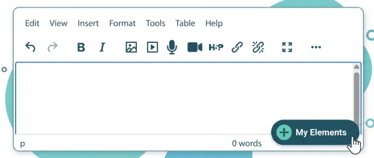
My Elements is built specifically around this client-side, no-code philosophy. When you open any editable area in Moodle (a course section, a text and media zone, or an activity description), the extension automatically detects the active editor and displays a discreet companion button. Clicking it opens a side panel where you can browse and configure ready-to-use content blocks.
Every element is fully customizable through intuitive visual controls (adjusting titles, body copy, icons), and theme-matched colors with real-time preview, and without ever touching raw code. Because each block remains permanently editable, you can update a deadline, reorder accordion items, or refine a callout at any point in the semester with a single click, completely eliminating the fear of broken HTML.
Now that you understand how a visual no-code layer keeps your content safe and editable, let’s walk through a practical workflow for building structured pages step by step.
A practical workflow for building structured pages without code
Clean Visual Rhythm
Lightweight summaries & clear pacing between sections.
Smart Encapsulation
Cards, callouts & accordions to package complex info.
Effortless Updates
Edit self-contained blocks without breaking layout.
Step 1: Organizing sections with clean visual rhythm
Start by mapping out your Moodle course with clear visual breaks. In Moodle’s Topics or Weekly format, each numbered section (Topic 1, Topic 2, Week 1, etc.) already provides a structural container.
The section summary area (at the top of each section) is your first opportunity to set the stage. Use it sparingly:
- A brief 1-2 sentence overview of what this section covers
- OR 2-3 key learning objectives or deadlines
- OR a single heading with a short introductory paragraph
Keep it short. If your section summary exceeds 150 words, you are probably trying to do too much.
Move detailed instructions into a Page resource or activity descriptions instead.
The goal is to create a rhythm that guides the eye naturally from one section to the next.
A well-paced Moodle course feels inviting to explore, while a dense, unstructured page triggers avoidance.
This step requires no special tools, just intentional restraint and consistent formatting, but it sets the foundation for everything that follows.
Step 2: Encapsulating complex information into readable containers
Once your Moodle course page has a clear rhythm, identify information that benefits from visual encapsulation.
In a section summary (or Text and media area), learning objectives and key takeaways are strong candidates.
In a Page resource or assignment description, assignment instructions, grading criteria, or FAQs work well. Instead of presenting this information as plain text, place it inside a dedicated block that signals its purpose.
An activity card groups instructions, criteria, deadlines, and resources into one cohesive unit, ideal for assignment briefs.
A callout box highlights a critical warning or tip so students cannot miss it.
An accordion collapses supplementary details (like extended FAQs or optional readings) so they do not clutter the main flow.
Each container reduces cognitive load by packaging related information together, making it easier for students to process and act on.
Whether you are structuring a section summary, a Page resource, or an assignment description, the principle is the same: group related content into visual blocks that students can scan quickly.
Step 3: Maintaining and updating content across semesters
A structured page is only valuable if you can keep it current.
At the start of each term, review your course blocks and update dates, links, or instructions as needed.
Because each block is self-contained, you can modify one section without touching the rest of the page. If a deadline changes, click the activity card, adjust the date, and save.
Over time, you will develop a library of reusable patterns: a standard welcome block, a consistent assignment brief format, a go-to FAQ structure. These patterns become part of your course design toolkit, making each new semester faster to set up and more polished from day one.
The initial investment in structure pays dividends in reduced maintenance effort and improved student experience.
With these three steps in place, your Moodle course pages are not just structured: they are designed to reduce cognitive load and guide learners naturally through the content.
This is where the real benefits for students become visible.
How clean page structure reduces cognitive load for learners
Freeing cognitive space for pedagogy over technical troubleshooting
When you spend hours searching for HTML solutions online, testing snippets that never quite work as expected, or waiting for IT approvals, that is time and mental energy taken away from designing learning experiences.
Customize Moodle without code means you can focus on what matters: clarifying instructions, sequencing activities, and supporting student progress.
The time you save on technical troubleshooting compounds over the semester. Instead of debugging a broken accordion or fixing a table layout on mobile, you can refine your assignment prompts, add targeted feedback resources, or create additional practice materials.
Your course improves because your effort goes into pedagogy, not into fighting with formatting tools.
Creating a predictable and scannable learning path for students
Students approaching a course page for the first time need to answer three questions quickly: Where am I? What do I need to do? What comes next?
A clean, structured layout provides immediate answers through visual cues. Headings signal topic boundaries. Containers group related information. Dividers create breathing room between sections.
When students can scan a Moodle course page and understand its organization in seconds, they spend more time engaging with the actual content. They feel confident navigating independently, knowing they will not miss critical instructions or lose their place.
This predictability reduces anxiety and supports self-directed learning, especially for students who are less experienced with online platforms.
With a clean structure in place, your Moodle course is already clearer and easier to navigate.
In the next sections, we will see how adding interactive content blocks and visual polish can take your course design even further.
When to move from page structure to interactive content blocks
Connecting clean page structure with interactive components
- Buttons draw attention to critical actions
- Tabs let students navigate between program details, assessment criteria, and resources without endless scrolling
- Accordions collapse FAQs or optional readings so they do not dominate the visual space.
These interactive components build on the structural foundation you have already created. They are not replacements for good layout but enhancements that add functionality and polish.
To explore how specific blocks like buttons, tabs, and accordions can elevate your course pages, see how to add buttons, tabs and accordions in Moodle without coding.
For guidance on refining the overall appearance and visual cohesion of your course, learn how to make a Moodle course look better. And for the pedagogical foundations behind effective page design, see how to design more engaging Moodle course pages.
Ready to build structured Moodle pages without writing code?
My Elements gives you a safe, visual way to organize your course content directly inside TinyMCE or Atto. No HTML, no CSS, no admin rights, no server plugins. Just a cleaner, more structured page that students can actually follow.