
How to design more engaging Moodle course pages
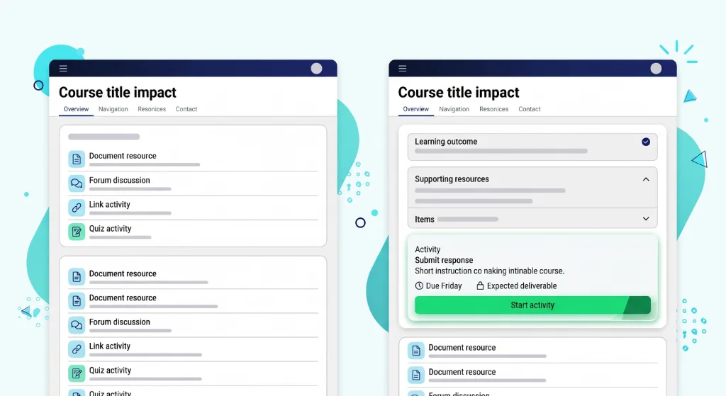
When learners open a course page, their first instinct is not to read every word. They scan the space to figure out where they are, what is expected of them, and where to start.
In many virtual learning environments, courses gradually become long vertical lists of files, forum links, and unstructured text blocks. Even with high-quality teaching materials, this density creates unnecessary friction. Students spend energy trying to decipher the layout rather than engaging with the actual subject matter.
Effective Moodle course page design is not about decorative graphics or complex visual themes. It is about pedagogical architecture.
By structuring content around a clear learning sequence, highlighting explicit objectives, and guiding learner attention, teachers can turn a crowded page into an intuitive learning journey.
Why course page structure matters for learners
A well-structured course page does more than present information, it shapes the entire study experience.
When students navigate an online environment, layout serves as an invisible guide. Clear organization directs focus toward core concepts, whereas an unstructured layout forces learners to spend cognitive effort simply deciphering where to click next.
Making content scannable at a glance
Online reading behavior differs significantly from reading printed textbooks. Students quickly scan headings, section dividers, and visual markers to evaluate workload and locate specific assignments.
When a Moodle section presents an unbroken wall of text or an undifferentiated list of links, scanning becomes impossible. To make content immediately readable, course pages benefit from:
- Distinct section titles that indicate topical milestones rather than generic dates.
- Visual breaks between instructional explanations, reading materials, and interactive tasks.
- Short, targeted paragraphs that deliver one core concept at a time.
Applying deliberate structure allows learners to assess weekly requirements in seconds and return directly to unfinished activities without searching.
Building learner confidence through spatial clarity
Spatial clarity builds learner confidence and promotes independent study. When the progression from one resource to the next follows an intuitive order, students feel guided throughout their learning journey.
Conversely, visual ambiguity creates hesitation. If an assignment link sits disconnected from its preparatory readings, students may miss critical instructions or submit incomplete work.
Structuring content logically gives learners an immediate mental model of the course, transforming passive browsing into purposeful study.
Key takeaway:
A well-structured course page reduces cognitive load and helps students focus on what truly matters: Learning.
How learning objectives help guide the page layout
In course design, learning objectives often remain confined to an introductory syllabus document.
However, embedding these goals directly into the layout of each module transforms abstract pedagogical targets into visible, tangible milestones for students. When learners understand the intended outcome before engaging with course materials, their comprehension and task completion rates improve significantly.
Turning abstract goals into visual section milestones
Displaying explicit learning objectives at the top of a section frames the content that follows. Instead of presenting a raw sequence of readings, an upfront summary gives purpose to every module component.
Effective course pages use section headers to anchor student expectations through straightforward techniques:
- Opening each topic with a brief outcome statement summarizing what students will understand or produce.
- Using active instructional verbs (such as analyze, calculate, or design) rather than vague topic labels.
- Grouping related resources under the specific competency they support.
Positioning objectives as visible guideposts helps students monitor their own progress and self-assess whether they have met the necessary criteria before moving to the next unit.
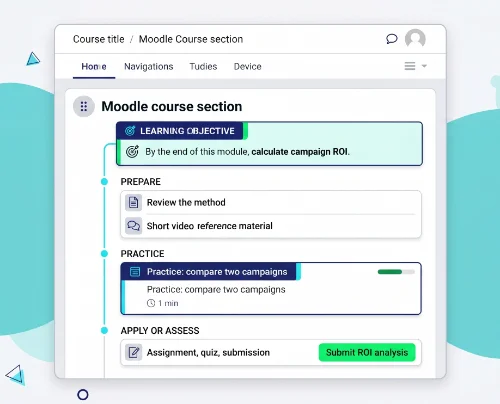
Example in action:
"By the end of this week, you will be able to calculate the return on investment for a marketing campaign using three different methods."
A student scrolling through the course page immediately knows what mastery looks like. Every resource that follows, whether a case study, a spreadsheet template, or a peer discussion, now has a visible purpose.
Contrast this with a section titled simply "Week 3: ROI" followed by a list of files. The first version guides action; the second version stores content.
Connecting every activity to an explicit learning outcome
A frequent cause of student disengagement is the perception of busywork.
When an activity appears in a section without explicit context, learners struggle to see how it contributes to their broader progress.
Connecting each resource directly to an explicit outcome eliminates ambiguity. A short explanatory line beneath a case study link or discussion forum clarifies its exact role in the learning process.
This contextual scaffolding demonstrates why an activity matters, turning a passive collection of links into an interconnected learning experience where every step serves an intentional purpose.
Using the learning sequence to organize content flow
The chronological sequence of teaching, introducing concepts, facilitating practice, and validating mastery, should translate directly into the visual flow of the page. An effective course layout does not simply store files: it guides learners through an intentional learning sequence from start to finish.
Structuring modules around the natural teaching sequence
A logical module follows a predictable instructional narrative rather than grouping items by file type. Instead of gathering all PDFs in one section and all quizzes in another, content should unfold in three movements.
First, preparation and discovery: a diagnostic baseline check, followed by short video lectures, introductory readings, or foundational review materials set the stage.
Next comes guided practice and collaboration, where discussion prompts, workshops, or interactive exercises let students test their understanding in low-stakes conditions.
Finally, application and evaluation bring the sequence to a close through graded assignments, self-assessment quizzes, or project submissions that demonstrate mastery.
Organizing modules along this natural teaching flow ensures students encounter theoretical concepts before attempting practical tasks, reducing errors and clarifying expectations at every step.
Creating a predictable learning rhythm across sections
Consistency across modules reduces the cognitive effort required to navigate the platform. When every section follows a familiar structural pattern, learners develop an intuitive mental routine.
Maintaining a uniform visual hierarchy throughout the course allows students to focus entirely on learning rather than reorienting themselves each week. When the placement of instructions, core materials, and evaluation activities remains stable across every topic, navigating the course becomes second nature.
How to make the next step obvious
One of the most common friction points in online courses is learner hesitation. When students finish reading a resource or watching a lecture, they should never have to wonder what to do next. An effective course layout provides clear directional cues, guiding learners effortlessly from one activity to the following milestone.
Clear action cues vs. ambiguous resource lists
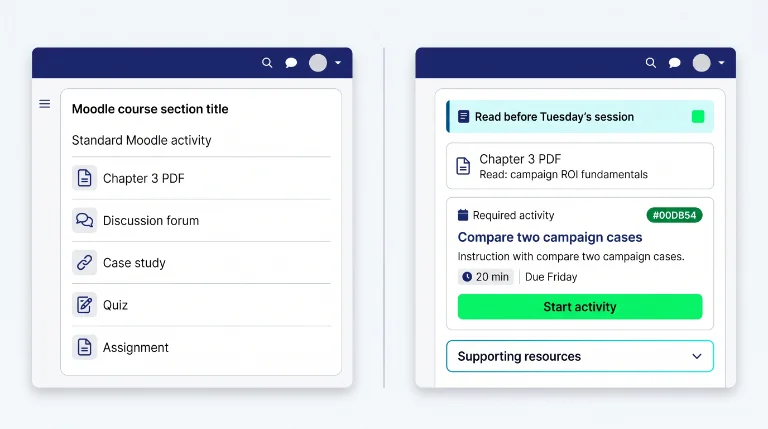
A standard list of uploaded documents often lacks instructional context. A link labeled simply Chapter 3 PDF leaves students uncertain whether they should skim the text, memorize key concepts, or prepare for an upcoming seminar.
Replacing ambiguous links with explicit action prompts transforms a static document archive into an actionable workflow:
- Use clear directive verbs in descriptions, such as Read before Tuesday's session or Submit your draft for peer review.
- Position actionable tasks immediately after their corresponding instructional materials.
- Incorporate prominent visual elements, such as action buttons or highlighted callouts, to draw attention to critical checkpoints.
Utilizing dedicated Moodle content blocks allows instructors to embed visually distinctive buttons and notice panels that make primary calls to action instantly recognizable without cluttering the page.
Signaling priorities, prerequisites, and mandatory tasks
Not all materials in a course carry the same instructional weight. Without visual differentiation, students may spend excessive time on optional background readings while rushing through mandatory graded assignments.
Establishing a clear hierarchy between core and supplementary content helps learners budget their study time effectively:
- Clearly distinguish required coursework from optional enrichment resources using concise labels or dedicated collapsible areas.
- Highlight prerequisite requirements before complex activities to ensure foundational knowledge is validated first.
- Make submission deadlines and estimated completion times explicit directly alongside task instructions.
When priorities are transparent, students manage their weekly workload with autonomy and focus their attention on key learning deliverables.
How to reduce cognitive overload on dense Moodle pages
As courses expand throughout an academic term, sections naturally accumulate extensive materials, assignments, and external references. When all this information is displayed simultaneously on a single long page, working memory becomes saturated. Reducing cognitive overload is not about deleting vital academic material; it is about organizing content so learners process one conceptual block at a time.
Decluttering sections without removing essential content
An overloaded screen creates visual noise that competes for attention with core learning materials. To maintain high academic rigor while keeping pages accessible, educators can streamline section presentation through thoughtful organization:
- Replacing long introductory text blocks with concise, high-impact instructional summaries.
- Nesting secondary references, glossaries, and supplementary readings inside structured collapsible panels or tabbed interfaces rather than listing them raw on the page.
- Removing redundant activity descriptions when the task title and instructions already communicate the requirement clearly.
Structuring content with clean, non-technical methods such as adopting a Moodle no code approach, enables teachers to organize complex layouts directly within their regular text editor without having to rely on custom HTML or developer assistance.
Chunking information to preserve student focus
Information chunking is a foundational instructional design principle that breaks complex concepts into smaller, manageable learning units. When applied to course layout, chunking prevents fatigue and supports continuous progress.
Structuring sections into distinct modular units offers clear pedagogical benefits:
- Dividing lengthy multi-part assignments into sequential stages (e.g., preparation, drafting, submission, review).
- Grouping related media, readings, and discussion prompts into self-contained topical cards.
- Providing visual breathing room between modules so students perceive a definite sense of completion before advancing.
By presenting content in bite-sized, logically grouped units, learners stay focused on the immediate task without feeling overwhelmed by the total volume of the curriculum.
How My Elements supports clearer course structure
Designing a readable, pedagogically structured course page should not require advanced technical skills or administrative privileges. My Elements provides a lightweight browser-based solution that empowers educators to organize their content directly within their existing Moodle editor, without waiting for server-side plugins or custom development.
Structuring pages directly inside your native Moodle editor
Educators often face a disconnect between their pedagogical vision and the technical constraints of their platform.
My Elements bridges this gap by integrating directly into the standard text editing workflow.
This approach offers immediate practical benefits for course design:
- Organizing sections with clear visual hierarchy and instructional flow without leaving the editor.
- Creating structured layouts, collapsible areas, and instructional callouts using familiar editing tools.
- Maintaining full control over content presentation without depending on institutional theme restrictions.
By working within the native environment, teachers can refine their course structure iteratively, aligning the layout precisely with their teaching sequence.
Instant pedagogical autonomy without server plugins or admin tickets
Traditional course customization often involves submitting requests to IT departments, waiting for plugin installations, or navigating complex theme configurations. My Elements removes these barriers entirely.
As a browser extension, the tool operates independently of server infrastructure, providing:
- Immediate deployment with no installation delays or administrative approval cycles.
- Consistent editing capabilities across any Moodle instance, regardless of institutional version or theme.
- Full pedagogical autonomy for teachers to structure, clarify, and enhance their course pages on their own schedule.
This independence allows educators to focus on what matters most: designing clear, engaging learning experiences for their students. Learn more about the full capabilities of the extension on the My Elements product page.
From structure to usability: guiding the learner throughout the course
A well-designed Moodle course page is not simply a collection of attractive elements; it is a coherent learning pathway that guides students from curiosity to mastery. By prioritizing pedagogical clarity, explicit objectives, and logical sequencing, educators create an environment where structure itself becomes a teaching tool.
Bridging pedagogical flow, interactive blocks, and visual polish
Effective course design unfolds in three complementary layers, each building on the previous one:
- Pedagogical structure: The foundation. Organizing content around learning objectives and teaching sequences ensures students always know where they are and what comes next.
- Functional components: The scaffolding. Adding interactive Elements like buttons, accordions, and callout boxes transforms static text into actionable, engaging learning experiences.
- Visual refinement: The finishing touch. Polishing spacing, color hierarchy, and typography enhances perceived professionalism and makes the course inviting to explore.
My Elements supports all three dimensions without requiring technical expertise. For educators ready to build structured pages without writing HTML or CSS, the no-code structuring guide offers practical methods.
Those seeking concrete interactive components can explore Moodle interactive Elements like tabs, accordions, and action buttons.
Finally, once pedagogical flow and functional elements are in place, instructors can refine the overall appearance using techniques from making Moodle courses look better.
Ready to transform your Moodle course pages into clear, engaging learning journeys?
Discover how My Elements empowers you to structure, organize, and enhance your courses directly in your browser—no plugins, no admin tickets, no coding required.